
Technique

Comparison Ad Examples

Comparison ads make the value self-evident by putting your option next to the alternative — a checkmark table, a 'vs. spreadsheets' framing, or a myth-vs-fact swipe. They work by pre-empting the comparison the buyer would do anyway and reframing the status quo as the problem. These examples show how to handle the 'why switch' objection before it's even raised.

Comparison ad example: Myth vs. fact swipe

Myth vs. fact swipe

Why it works: Alternating a common misconception with the correction sets up tension the viewer wants resolved, driving the swipe. It positions the brand as the credible authority while gently disqualifying competitors' claims. The last card converts the newly educated viewer with a clear next step.

Seen in Carousel Ad Examples
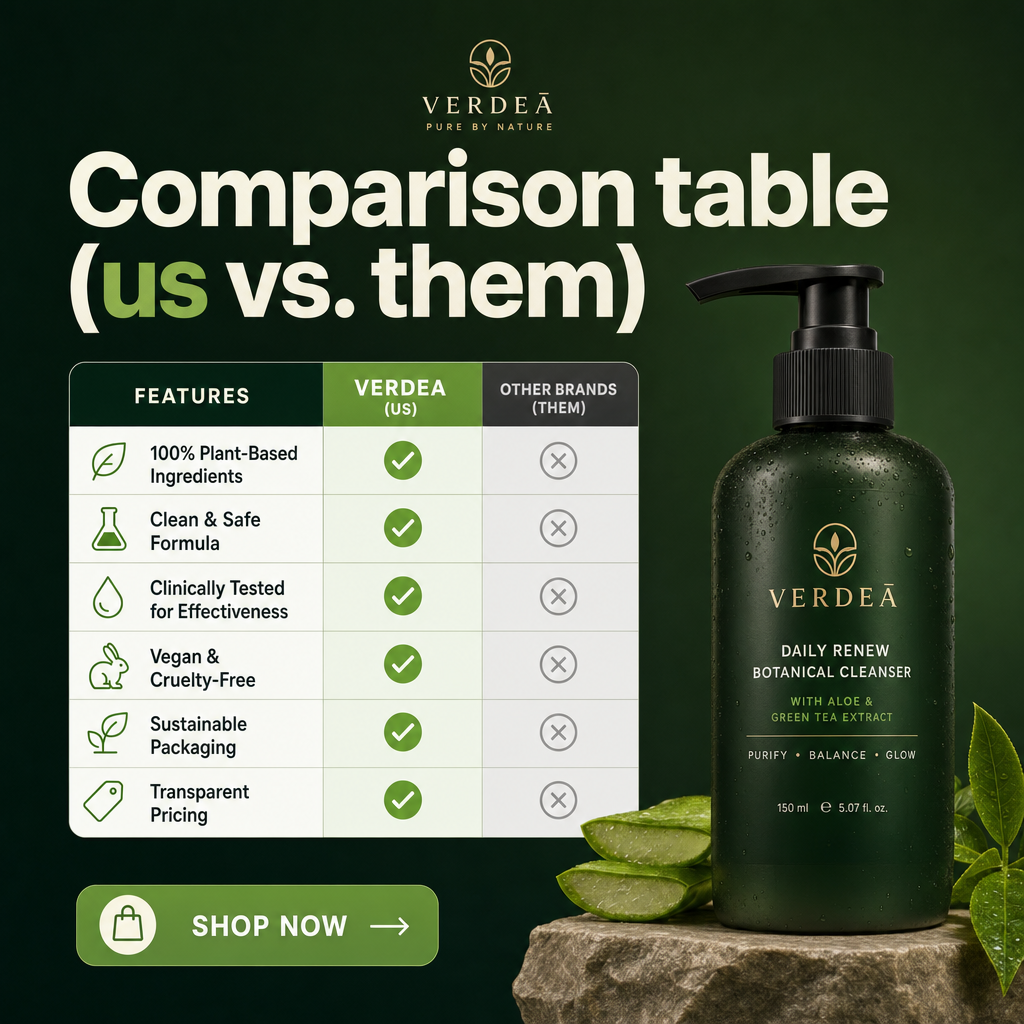
Comparison ad example: Comparison table (us vs. them)

Comparison table (us vs. them)

Why it works: A simple checkmark-vs-cross table makes the value proposition self-evident without a word of persuasion copy. It handles objections by pre-empting the comparison the buyer would do anyway. Static format keeps the table crisp and readable, unlike a fleeting video.

Seen in Static Ad Examples

Want comparison ads made for your brand?

statie.sh researches your brand and competitors, then ships on-brand static ads — in this style and others — to your inbox or Slack every morning. One click ships the finished image.

Start generating ads

Frequently asked questions

Why are comparison ads persuasive?

They do the buyer's evaluation for them. A simple side-by-side makes the advantage obvious without persuasion copy, and it pre-empts the comparison shoppers run in their heads — often against the status quo they already use.

Should I compare against a named competitor?

Often it's more effective to compare against the real alternative — the status quo, like spreadsheets or a manual process — than to name a rival. It meets buyers where they are and avoids the risks of direct competitor call-outs.

What format works best for comparison ads?

A clean checkmark-vs-cross table for a static, or an alternating myth-vs-fact sequence for a carousel. Keep the rows few and the contrast sharp so the advantage reads instantly.

More techniques

Browse all ad examples