Carousel Ad Examples

Carousel ads win when every card gives the viewer a reason to swipe to the next, turning a single impression into a mini narrative. The strongest ones treat the first card as a hook, the middle cards as proof or progression, and the last as the offer. These examples show the sequencing tricks that keep a thumb moving toward the CTA.

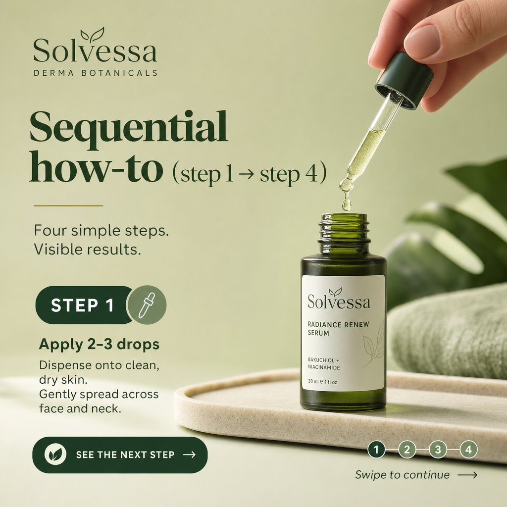
carousel ad example: Sequential how-to (step 1 → step 4)

Sequential how-to (step 1 → step 4)

Why it works: Numbered steps create an open loop — the viewer swipes to see how the process ends. Each card advances a small promise, so momentum builds toward the final CTA card. It also demonstrates the product in use, which pre-empts "how does this actually work" objections.


carousel ad example: Product line showcase (one item per card)

Product line showcase (one item per card)

Why it works: Giving each product its own card lets shoppers self-select the one that fits, effectively a mini catalog inside the feed. The dynamic format can auto-personalize the order by relevance, raising the odds the first card lands. Each card's CTA deep-links to that exact product page, shortening the path to purchase.

carousel ad example: Single panoramic image split across cards

Single panoramic image split across cards

Why it works: Slicing one wide image across the cards creates a surprising, interactive reveal that rewards swiping. The novelty itself earns engagement, which the algorithm reads as interest. The final card resolves the image and delivers the offer, paying off the curiosity.

carousel ad example: Myth vs. fact swipe

Myth vs. fact swipe

Why it works: Alternating a common misconception with the correction sets up tension the viewer wants resolved, driving the swipe. It positions the brand as the credible authority while gently disqualifying competitors' claims. The last card converts the newly educated viewer with a clear next step.

carousel ad example: Social-proof stack (a testimonial per card)

Social-proof stack (a testimonial per card)

Why it works: A run of distinct customer quotes builds cumulative credibility as the viewer swipes through a wall of proof. Variety of voices covers different objections without a single card feeling crowded. By the offer card, skepticism is already worn down.

carousel ad example: Problem → agitate → solution across three cards

Problem → agitate → solution across three cards

Why it works: Spreading a classic copy structure across cards gives each beat room to breathe and paces the persuasion. The middle agitation card deepens the felt need before the solution lands, making the offer feel earned. This structure suits considered purchases where one image can't carry the argument.

Get fresh carousel ad ideas every morning

statie.sh researches your brand and competitors, then ships on-brand static carousel ads to your inbox or Slack daily. One click ships the finished image.

Start generating ads

Frequently asked questions

How many cards should a carousel ad have?

Three to five cards is the sweet spot for most objectives. Enough to tell a story or show variety, few enough that viewers reach the CTA before dropping off. Put your strongest card first because many people never swipe.

What goes on the first carousel card?

The hook. Assume most viewers only see card one, so it must communicate the core value and give a reason to swipe. If the first card can't stand alone, the carousel underdelivers.

Do carousel ads outperform single-image ads?

They often do for product discovery and storytelling because the interaction signals engagement and lowers CPMs. Single images can still win for a single, urgent offer. Test both against your specific objective.

More formats

Browse all ad examples