Static Ad Examples

Static ads strip away motion and force the creative to win on a single frame — which is exactly why the best ones are so disciplined about hierarchy and message. One idea, one focal point, one call to action, all legible in a glance. These examples show why a well-made still often beats expensive video on cost per result.

static ad example: One big benefit, one product, one CTA

One big benefit, one product, one CTA

Why it works: Radical simplicity means the viewer grasps the whole offer in a second, which is all a static frame gets. With nothing competing for attention, the single benefit statement lands hard. The lone CTA removes any decision friction about what to do next.
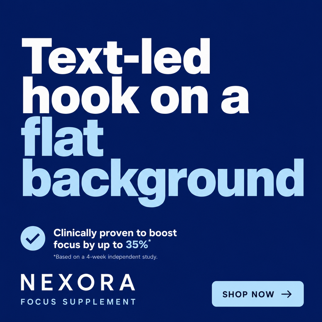
static ad example: Text-led hook on a flat background

Text-led hook on a flat background

Why it works: When the words are the creative, a punchy hook in big type can out-stop a busy photo because it reads instantly. The flat background eliminates visual noise so the message dominates. It's also cheap to produce and iterate, ideal for rapid hook testing.

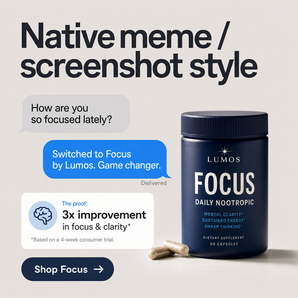
static ad example: Native meme / screenshot style

Native meme / screenshot style

Why it works: Styling the ad like a phone screenshot or text thread borrows the trust and casualness of organic content. It slips past the viewer's ad radar, earning a read before they realize it's paid. The relatable framing makes the product feel recommended, not sold.

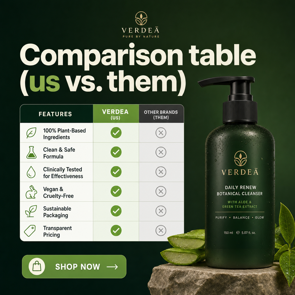
static ad example: Comparison table (us vs. them)

Comparison table (us vs. them)

Why it works: A simple checkmark-vs-cross table makes the value proposition self-evident without a word of persuasion copy. It handles objections by pre-empting the comparison the buyer would do anyway. Static format keeps the table crisp and readable, unlike a fleeting video.

static ad example: Bold offer badge over product

Bold offer badge over product

Why it works: A high-contrast price or discount badge gives the eye an anchor and communicates value instantly. Pairing it with a clean product shot keeps the deal and the item unmistakably linked. The urgency of the number does what a long caption can't.

static ad example: Founder / handwritten note style

Founder / handwritten note style

Why it works: A personal, letter-style static reads as sincere and human, which builds trust for a first-touch audience. The intimate tone differentiates from polished competitor creative. A single underlined CTA keeps the human feel while still driving action.

Get fresh static ad ideas every morning

statie.sh researches your brand and competitors, then ships on-brand static static ads to your inbox or Slack daily. One click ships the finished image.

Start generating ads

Frequently asked questions

Are static ads still effective compared to video?

Yes. Static ads frequently match or beat video on cost per result because they're faster to produce, easier to test in volume, and force a disciplined single message. Many top media buyers run static-first and add video only where it clearly wins.

What makes a strong static ad?

One idea, one focal point, and one call to action, all readable in a glance. If a viewer can understand the offer in a second at thumbnail size, the static is doing its job.

How many static ad variations should I test?

Because statics are cheap to make, test several hooks and angles at once rather than minor color tweaks. Find the winning message first, then iterate on the layout around it.

More formats

Browse all ad examples