Technique

Minimalist Ad Examples

Minimalist ads win on restraint: one idea, one focal point, one call to action, all legible in a glance. In small, cluttered placements like display or a fast feed, ruthless hierarchy beats clever detail because the viewer only gives the ad a fraction of a second. These examples show how disciplined, uncluttered creative earns the click when there's no room for noise.

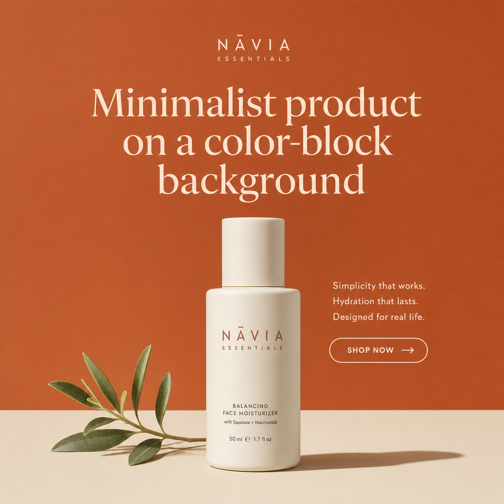
Minimalist ad example: Minimalist product on a color-block background

Minimalist product on a color-block background

Why it works: A single product centered on a bold, on-brand color reads as intentional design, which Instagram's audience rewards with attention. The restraint makes the product the hero and keeps the frame uncluttered at feed size. A short caption with one CTA lets the visual carry the persuasion.

Seen in Instagram Ad Examples


Minimalist ad example: High-contrast CTA button banner

High-contrast CTA button banner

Why it works: A single bright button against a calm background creates an obvious click target the eye jumps to first. Because display inventory is small and cluttered, this contrast-driven hierarchy matters more than any headline. Keeping the copy to three or four words means it stays legible at 300x250.

Seen in Display Ad Examples
Minimalist ad example: Animated stat reveal (HTML5)

Animated stat reveal (HTML5)

Why it works: A short animation that counts up a number or reveals a benefit captures peripheral attention without being obnoxious. Motion earns the glance; the frozen end-frame then delivers the offer and CTA. It loops slowly so it never feels like a flashing 2010-era banner.

Seen in Display Ad Examples
Minimalist ad example: Product cutout on brand color

Product cutout on brand color

Why it works: A clean product cutout on a solid brand color communicates the category instantly, even to someone half-ignoring the ad. The recognizable silhouette does the work that copy can't at this size. A small logo lockup builds recall for retargeting later.

Seen in Display Ad Examples
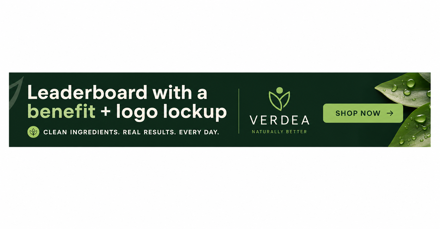
Minimalist ad example: Leaderboard with a benefit + logo lockup

Leaderboard with a benefit + logo lockup

Why it works: The wide 728x90 format suits a left-to-right read: benefit statement, then logo, then CTA. This linear flow matches how the eye scans a horizontal strip above content. Restraint keeps it from competing with the article it sits above, which paradoxically earns more trust.

Seen in Display Ad Examples
Minimalist ad example: One big benefit, one product, one CTA

One big benefit, one product, one CTA

Why it works: Radical simplicity means the viewer grasps the whole offer in a second, which is all a static frame gets. With nothing competing for attention, the single benefit statement lands hard. The lone CTA removes any decision friction about what to do next.

Seen in Static Ad Examples
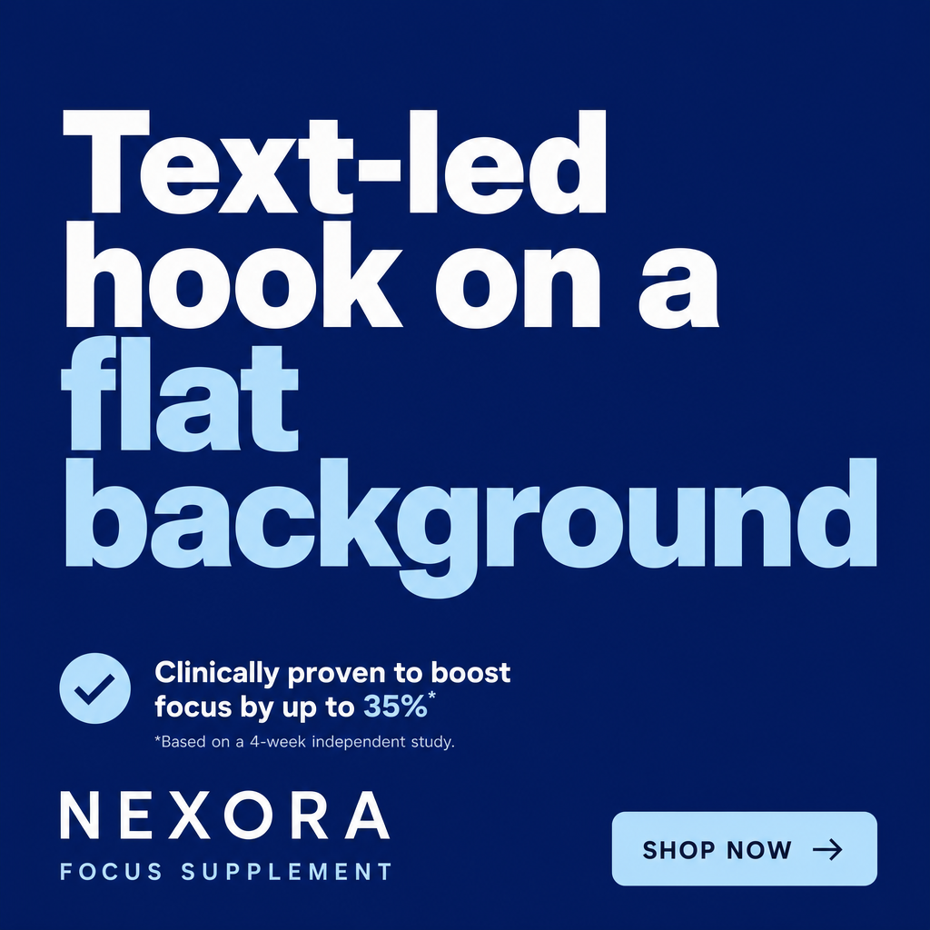
Minimalist ad example: Text-led hook on a flat background

Text-led hook on a flat background

Why it works: When the words are the creative, a punchy hook in big type can out-stop a busy photo because it reads instantly. The flat background eliminates visual noise so the message dominates. It's also cheap to produce and iterate, ideal for rapid hook testing.

Seen in Static Ad Examples

Want minimalist ads made for your brand?

statie.sh researches your brand and competitors, then ships on-brand static ads — in this style and others — to your inbox or Slack every morning. One click ships the finished image.

Start generating ads

Frequently asked questions

Why do minimalist ads perform well?

Because attention is scarce. With one message, one focal point, and one CTA, a viewer grasps the whole offer in the split second they give it — anything competing for attention gets ignored, especially at small sizes.

When should I use a minimalist ad?

Whenever space or attention is tight — display banners, a fast-scrolling feed, or retargeting where the viewer already knows you. It's also cheap to produce and iterate, which makes it ideal for rapid hook testing.

How do I keep a minimalist ad from looking empty?

Use strong contrast and typography to make the single focal point feel intentional rather than sparse. Generous negative space around one clear message reads as premium design, not a missing element.

More techniques

Browse all ad examples