Instagram Ad Examples

Instagram is an aesthetic-first platform, so ads that feel designed and on-trend outperform anything that screams "advertisement." The winning creative either blends seamlessly into a curated feed or leans fully into raw, phone-shot UGC — the awkward middle ground gets ignored. These examples show both routes and why each earns attention from a highly visual audience.

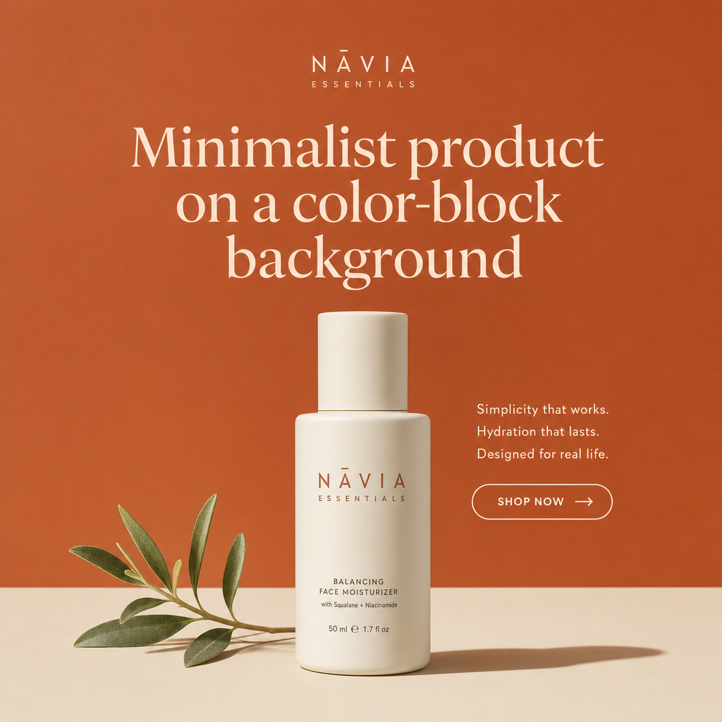
Instagram ad example: Minimalist product on a color-block background

Minimalist product on a color-block background

Why it works: A single product centered on a bold, on-brand color reads as intentional design, which Instagram's audience rewards with attention. The restraint makes the product the hero and keeps the frame uncluttered at feed size. A short caption with one CTA lets the visual carry the persuasion.
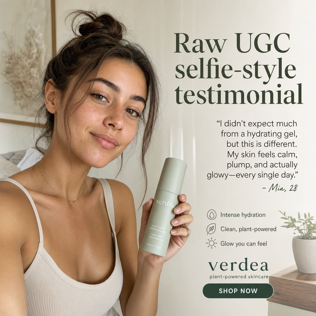
Instagram ad example: Raw UGC selfie-style testimonial

Raw UGC selfie-style testimonial

Why it works: Phone-shot, slightly imperfect footage or photos read as authentic and stop the scroll precisely because they don't look like ads. The creator's face builds parasocial trust faster than any brand logo. Pairing it with a captioned quote means the message lands even on mute.

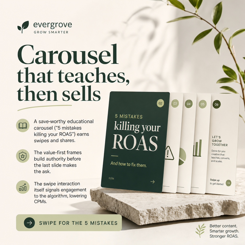
Instagram ad example: Carousel that teaches, then sells

Carousel that teaches, then sells

Why it works: A save-worthy educational carousel ("5 mistakes killing your ROAS") earns swipes and shares, extending reach beyond the paid audience. The value-first frames build authority before the last slide makes the ask. The swipe interaction itself signals engagement to the algorithm, lowering CPMs.

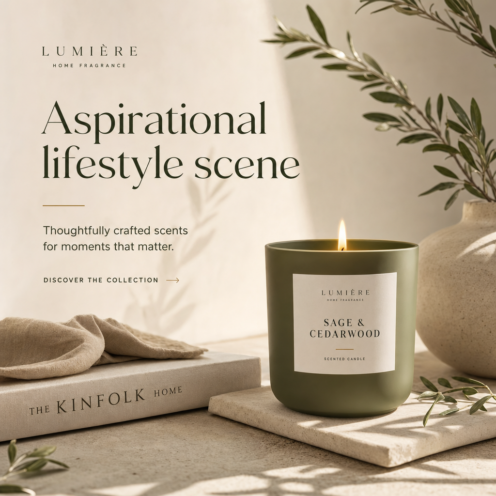
Instagram ad example: Aspirational lifestyle scene

Aspirational lifestyle scene

Why it works: Showing the product inside an aspirational moment sells the identity, not just the item, which is how premium brands win on Instagram. The viewer pictures themselves in the scene, making desire do the heavy lifting. A subtle CTA keeps the tone editorial rather than salesy.

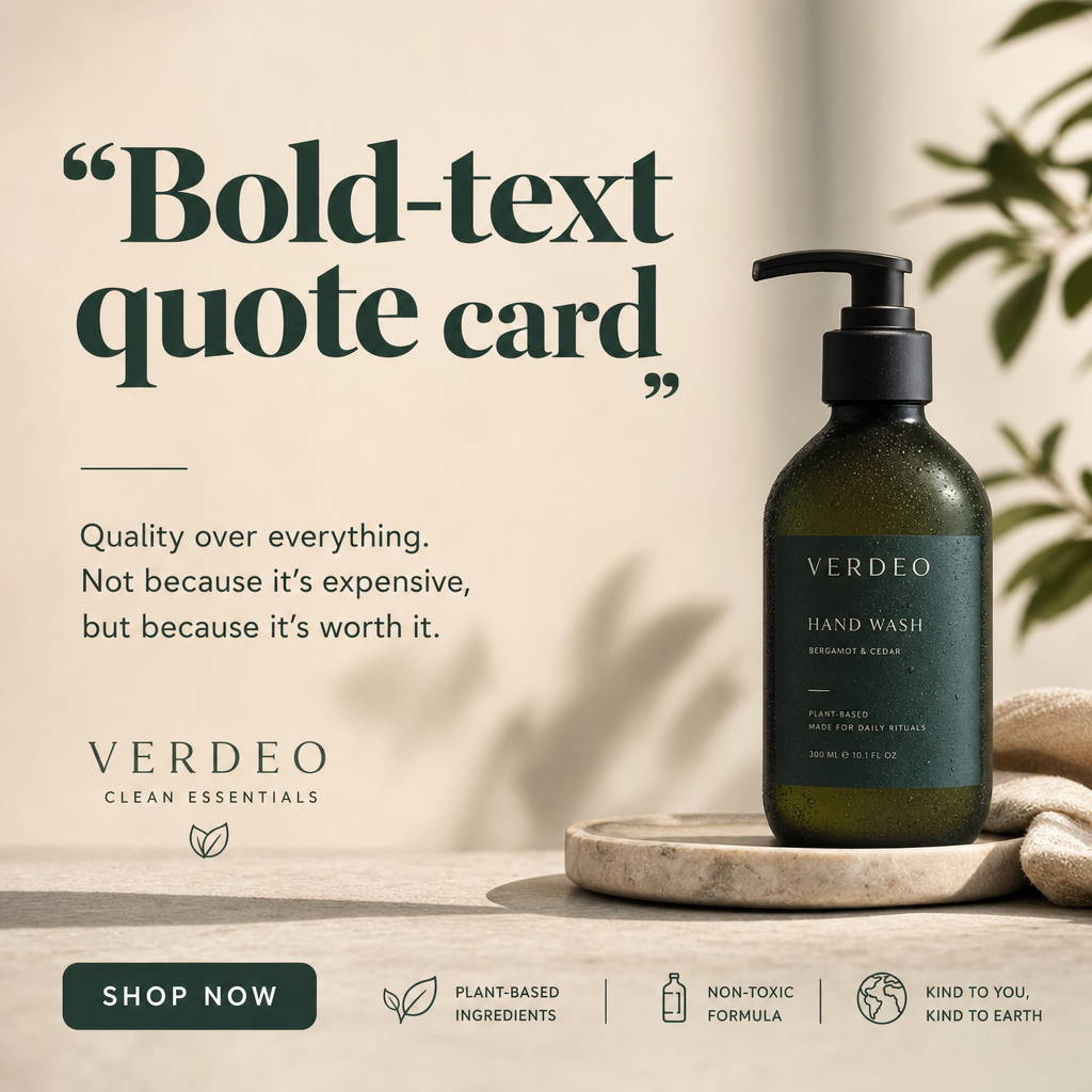
Instagram ad example: Bold-text quote card

Bold-text quote card

Why it works: A punchy, opinionated statement in large type is instantly readable and shareable, which is native to how Instagram already works. It functions as a hook that makes the reader pause to agree or disagree. The caption then bridges from the sentiment to the product.

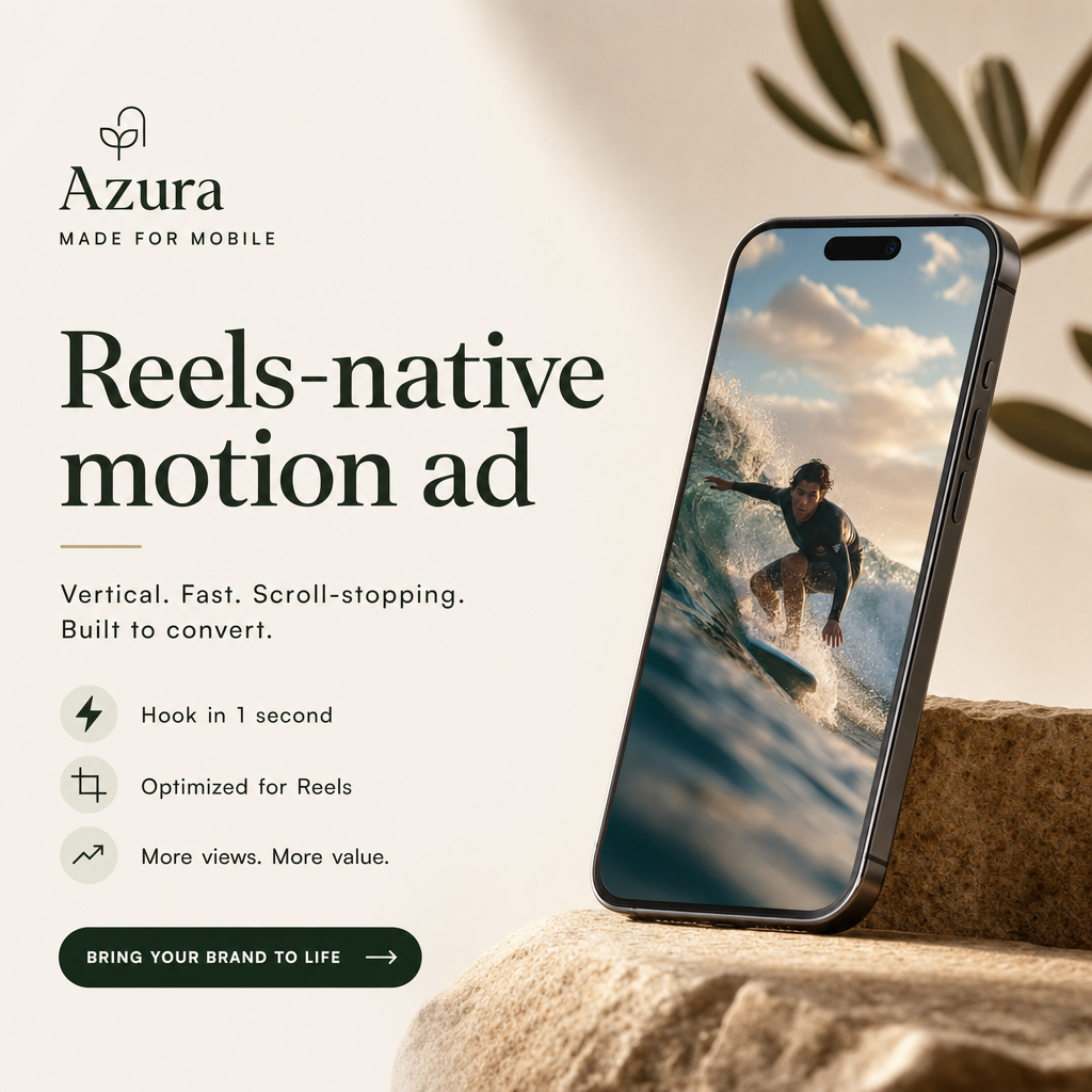
Instagram ad example: Reels-native motion ad

Reels-native motion ad

Why it works: Vertical, fast-cut creative built for Reels matches the format the viewer expects, so it doesn't feel interruptive. The first second delivers a visual hook before attention drops. On-screen captions and a clear end-card CTA convert viewers who watch on mute.

Get fresh Instagram ad ideas every morning

statie.sh researches your brand and competitors, then ships on-brand static Instagram ads to your inbox or Slack daily. One click ships the finished image.

Start generating ads

Frequently asked questions

Do Instagram ads need to look different from Facebook ads?

Yes. Instagram rewards a higher aesthetic bar and native formats like Reels and carousels, while Facebook tolerates more direct-response, text-heavy creative. Reusing the exact same asset across both usually underperforms on Instagram.

What's the best format for an Instagram ad?

Square (1080 x 1080) and vertical (1080 x 1350) work in the feed, while Stories and Reels need full 1080 x 1920 vertical. Match the format to the placement rather than cropping one asset to fit everywhere.

Does UGC really beat polished creative on Instagram?

Often, yes — for direct response. Raw, authentic UGC tends to win on cost per acquisition, while polished brand creative builds premium perception. Test both, because the right mix depends on your product and audience.

More formats

Browse all ad examples