Display Ad Examples

Display ads have to work in tiny, cluttered spaces next to real content, so ruthless visual hierarchy beats clever copy every time. The best banners establish one message, one focal image, and one high-contrast button that reads in a glance. These examples show how to earn a click when you have a fraction of a second and a fraction of the screen.

display ad example: High-contrast CTA button banner

High-contrast CTA button banner

Why it works: A single bright button against a calm background creates an obvious click target the eye jumps to first. Because display inventory is small and cluttered, this contrast-driven hierarchy matters more than any headline. Keeping the copy to three or four words means it stays legible at 300x250.
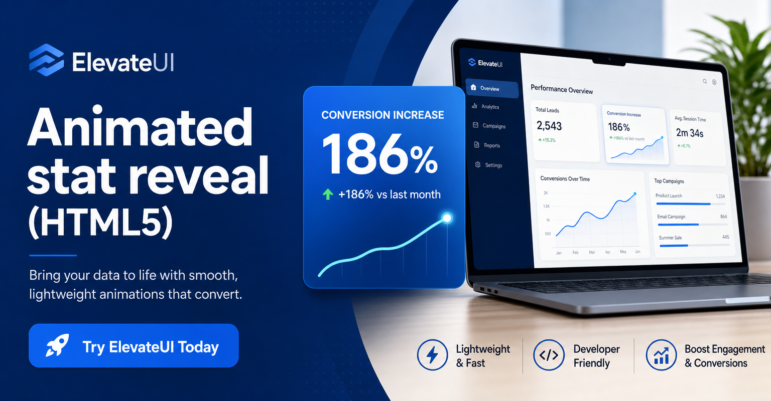
display ad example: Animated stat reveal (HTML5)

Animated stat reveal (HTML5)

Why it works: A short animation that counts up a number or reveals a benefit captures peripheral attention without being obnoxious. Motion earns the glance; the frozen end-frame then delivers the offer and CTA. It loops slowly so it never feels like a flashing 2010-era banner.

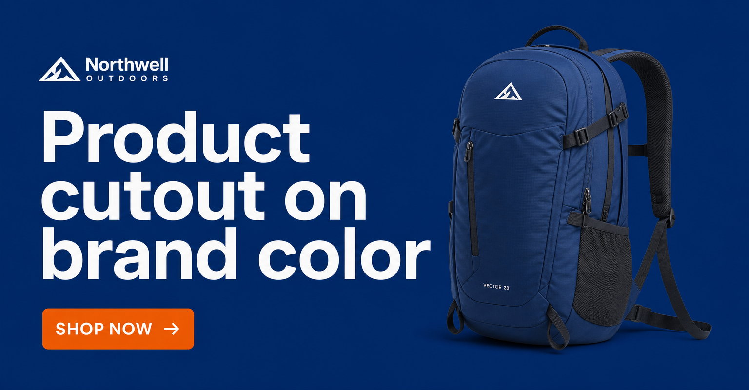
display ad example: Product cutout on brand color

Product cutout on brand color

Why it works: A clean product cutout on a solid brand color communicates the category instantly, even to someone half-ignoring the ad. The recognizable silhouette does the work that copy can't at this size. A small logo lockup builds recall for retargeting later.

display ad example: Retargeting reminder with the exact item

Retargeting reminder with the exact item

Why it works: Showing the specific product a visitor viewed turns the banner into a personalized nudge rather than a generic pitch. The familiarity lowers friction because the shopper already considered buying it. A time-bound offer ("10% off, today only") adds the urgency that closes the loop.

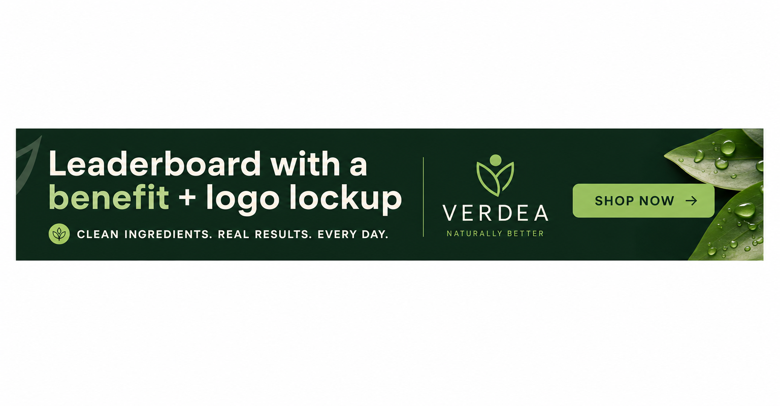
display ad example: Leaderboard with a benefit + logo lockup

Leaderboard with a benefit + logo lockup

Why it works: The wide 728x90 format suits a left-to-right read: benefit statement, then logo, then CTA. This linear flow matches how the eye scans a horizontal strip above content. Restraint keeps it from competing with the article it sits above, which paradoxically earns more trust.

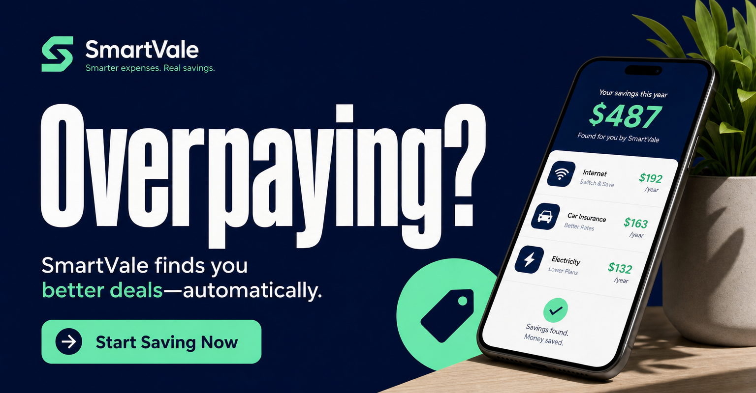
display ad example: Bold single-word hook banner

Bold single-word hook banner

Why it works: One arresting word ("Overpaying?") set large works because display readers won't process a sentence. It provokes a micro-reaction that makes the eye linger long enough to see the offer. The supporting line and button resolve the tension the word created.

Get fresh display ad ideas every morning

statie.sh researches your brand and competitors, then ships on-brand static display ads to your inbox or Slack daily. One click ships the finished image.

Start generating ads

Frequently asked questions

What are the most common display ad sizes?

The top performers are the medium rectangle (300 x 250), leaderboard (728 x 90), large rectangle (336 x 280), wide skyscraper (160 x 600), and mobile banner (320 x 50). Designing for these five covers most inventory.

Why do simple display ads outperform detailed ones?

Display units are small and compete with the page content around them, so viewers only give them a fraction of a second. One message, one focal point, and one high-contrast CTA get processed in that window; anything more gets ignored.

Should display ads be static or animated?

Subtle animation can lift attention, but it has to end on a clear static frame with the offer and CTA in case the loop is missed. Static ads are simpler to produce at scale and never risk looking dated or distracting.

More formats

Browse all ad examples